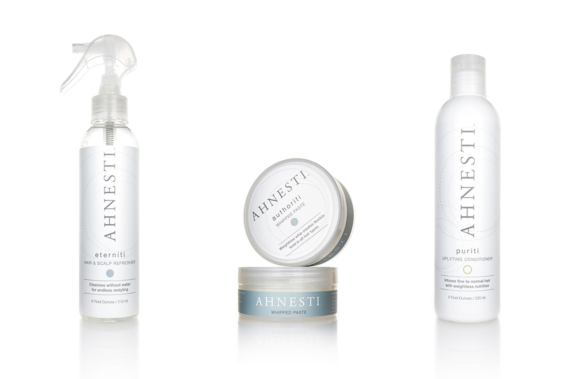
When we met Ahnesti ’s founder, Lorri Weisen, she’d spent 7 months working with a team to create an all-natural hair-care formula made with ingredients certified by Whole Foods and the European Union’s stringent standards.
Months later, with her product and packaging squared away, Lorri realized she had a marketing problem: is it possible to photograph a white package on a white background? Our 8th Street Studio photographer Gary Ness was up for the task. He’s spent 27 years shooting luxury brands such as Cartier and Gucci. Gary knew Ahnesti needed clean, elegant lighting to enhance its white, shimmering packaging.
Professional Technique
Product photography can be deceptive in its minimalism. Photos that look effortless are usually the most difficult to shoot. Gary takes his time and carefully plans every detail to ensure the product looks its best while still looking natural.
White is relative to its background; a white object must have tone (a gray value) to not blend in to its background or appear flat and dull. To bring out each bottle’s natural sheen, Gary used advanced lighting techniques to define each bottle’s edges and create a subtle sense of dimension. This way, the label’s subtle shine and the bottle’s cylindrical qualities are visible through the light’s reflections and refractions.
During the photo shoot, Gary positioned each product front and center against a white background. He lit the bottle with a darker tone of white while independently lighting the background in a brighter shade of white. This way, a white bottle has definition against a white background. In less capable hands, the images could have appeared flat and lifeless. Instead the final images appear as clean and pure as Ahnesti’s ingredients.
